
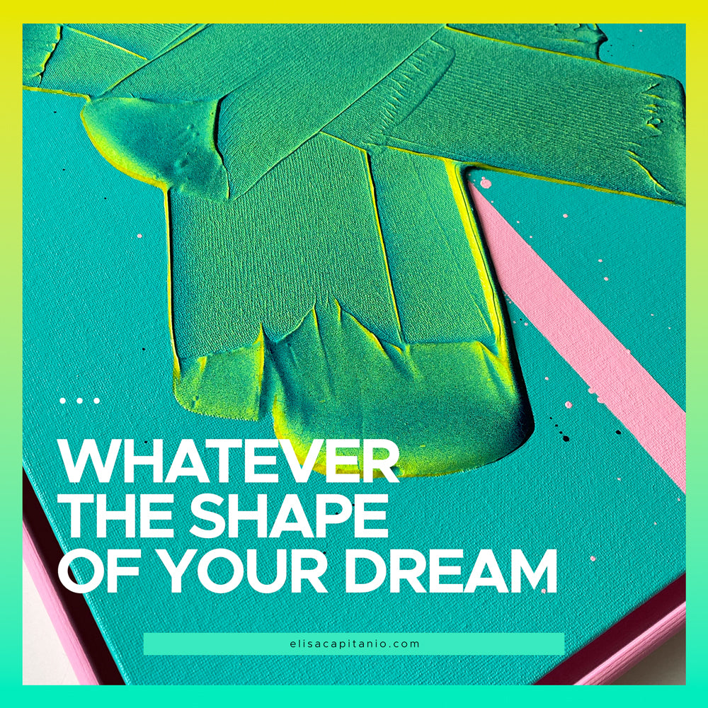
It's all about contrast
Do you want to know a little secret?
One of the major reasons why I started using lines on my artworks was to create contrast. (And movement. But this blog post is about contrast!)
Why?
Contrast is a fundamental concept in art, and it is particularly important when creating abstract pieces.
Abstract art is defined by its lack of representational elements and it focuses primarily on colour, form, and texture. These elements are used to create an emotional response in the viewer, and contrast is a key tool that artists use to achieve this.
Contrast refers to the difference between two elements in a piece of art. This can be a difference in colour, value, texture, or form. It is the contrast between these elements that creates a sense of depth and movement in a piece, and this is the key ingredient to make your abstract art super powerful.
1. Colour
One of the most basic ways to create contrast in abstract art is through the use of colour.
Colour contrast can be achieved by using complementary colours, such as blue and orange (or as I prefer blue and pink!), or by using contrasting values, such as light and dark.
The use of contrasting colours creates a sense of tension and movement in a piece, and it is what makes abstract art so visually dynamic.
2. Texture
Another way to create contrast in abstract art is through the use of texture. Texture contrast can be achieved by using different materials or techniques.
For example, an artist might use a smooth, shiny surface next to a rough, textured surface. The contrast between these textures creates a sense of depth and movement in a piece, and it is what makes abstract art so visually interesting.
If you are interested in introducing texture into your artworks, you can explore gel and sprays to create different effects.
For example, there are spray that create a concrete look - just to name one, or you can add a gloss medium to your colour to make it thicker and shinier!
3. Value
Value contrast is also an important element in abstract art. Value refers to the lightness or darkness of a colour.
Value contrast can be achieved by using light and dark colours, or by using different values of the same colour.
For example, you might use a light blue next to a dark blue. The contrast between these values creates a sense of depth and movement in a piece, and it is what makes abstract art so visually striking.
One of the easiest ways to check if your composition has enough contrast in values is to take a picture of it, and convert it to black and white. If the painting still works in black and white, then it's a good one :)
4. Form
Form contrast is also an important element in abstract art. Form refers to the shape and structure of a piece.
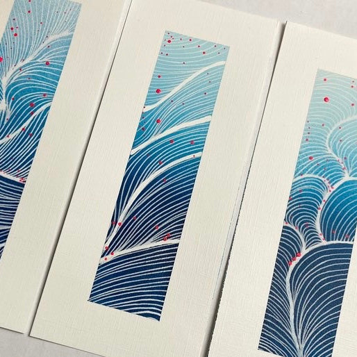
Form contrast can be achieved by using different shapes or forms. For example, you can use a geometric shape next to an organic shape. Or if you are using the fineline applicator, like I do, I have a sinuous element in a dynamic composition made with sponges.
The contrast between these forms creates a sense of depth and movement in a piece, and it is what makes abstract art so visually dynamic.
Contrast is a fundamental concept in abstract art. It is the contrast between elements like colour, value, texture, and form that creates a sense of depth and movement in a piece, and it is what makes abstract art so powerful.
By understanding and utilising contrast, you can create abstract pieces that are visually dynamic, emotionally powerful, and truly one-of-a-kind.
Those sort of pieces that make you very proud, you know the ones I'm talking about ;)
Written by Elisa Capitanio
Artist & Designer
♥️ Making a home & colourful abstract paintings
✨ Art for real homes & lived lives


%0AWhy?%0AContrast%20i...)